


A colourful interior design It’s often not the case that we’re bold right from the very start. Sometimes, the concept for a home begins to take shape from a rather understated, safe starting point, and then, as the design process unfolds, it gradually reveals that it could accommodate more character, more depth and more individuality.
That is exactly what happened with this project.
 Source: own design
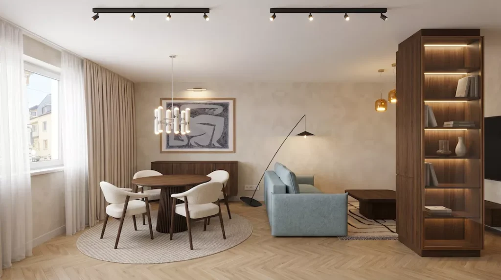
The original concept was an almost entirely beige, monochrome world. A touch of Japandi, a touch of Scandinavian style, very calm, very clean-lined, with minimal contrast. Black details were almost entirely ruled out, and the space was moving more towards a safe, tonally uniform direction.
Then, as we delved deeper into the design process, it became clear that this home could accommodate even more than that. It didn’t become more garish, but more personal. Not more chaotic, but more layered. Alongside the beige base, we introduced baby blue, terracotta, bronze, amber and, finally, black.
And so a home was created that is at once elegant, fresh, warm and full of character.
Colourful interior design based on a beige palette
A understated, beige colour scheme can be a very good starting point. It creates a sense of calm, is easy to like, and seems like a safe choice at first glance. The question is rather whether it is really enough for the home we want to live in for the long term.
The initial direction here was based on a clean, tonally uniform palette. It is important, however, not to confuse this with the achromatic world. ‘Achromatic’ refers to the black-white-grey scheme, whereas in this case we started with a warm, natural, monochrome base.
This basic approach could have worked on its own, but the characteristics of the space, the client’s personality and the potential inherent in the flat ultimately steered the design towards a bolder concept.
Source: own design
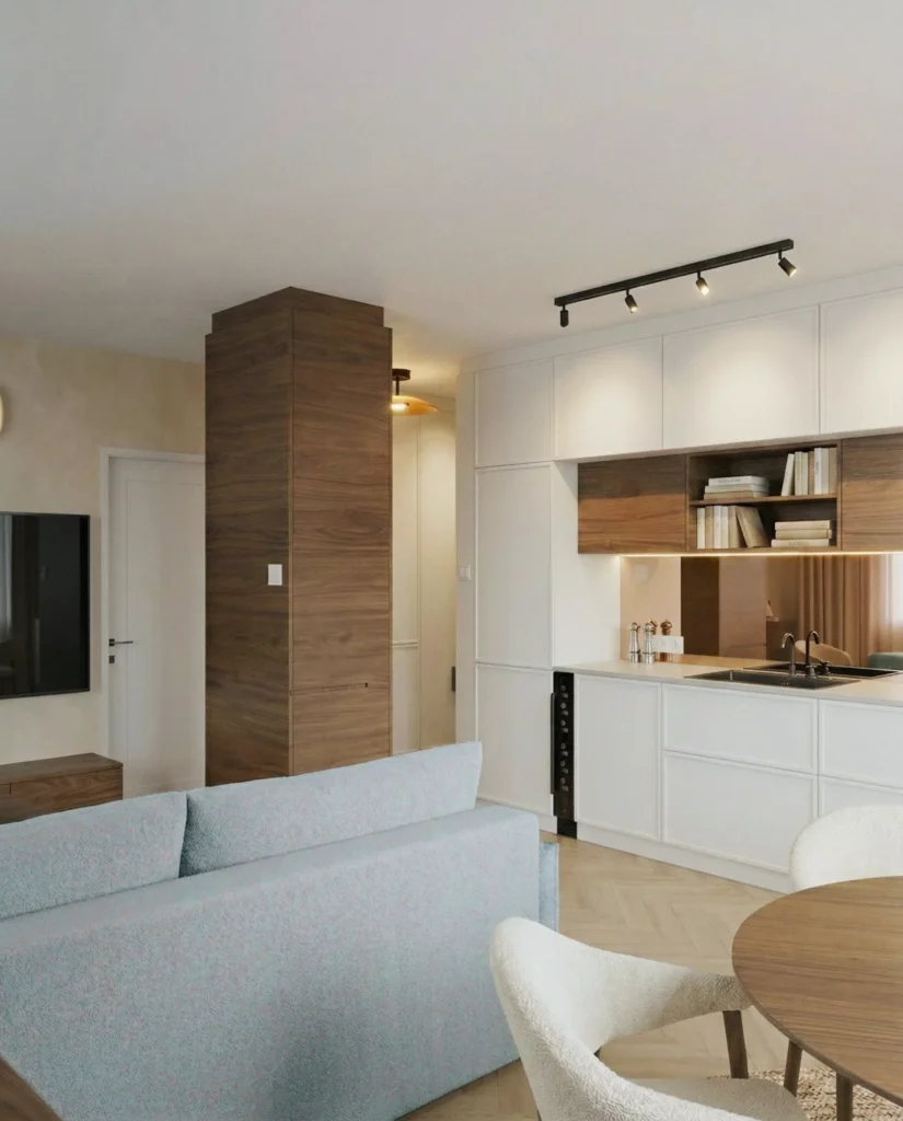
The colours didn’t arrive all at once. At first, they appeared merely as subtle accents, but it gradually became clear that they would not detract from the tranquillity of the home; on the contrary, they would help to give it its own character.
This is one of the most important lessons to be learnt from this project. A distinctive interior does not work well simply because we use bold design elements in every room. Rather, it works well because the colours, materials and details are thoughtfully coordinated with one another.
1. The kitchen that lets the colours shine through
The kitchen–dining–living area is one of the most important parts of the home, so it was particularly important to create a solid foundation here.
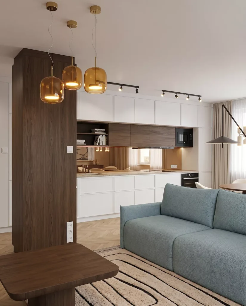
The kitchen was eventually painted in a shade of off-white. This may seem like a low-key decision at first glance, but it was actually a very deliberate choice. In a space like this, where baby blue, terracotta, bronze and darker tones all play a part, there is a need for an element that does not seek to compete with the surrounding details.
Source: own design
The off-white kitchen achieves exactly that. It is uncluttered, practical and tailored to the client’s requirements down to the last millimetre, yet it is by no means sterile. Rather, it provides a calm backdrop that allows the dining area, the living room and the accessories to take centre stage.
The bronze mirror and bronze glass already begin to hint at the subtle elegance that will later recur in several rooms. Not over large surfaces, nor in an overt way, but as subtle details. That is precisely what makes it so exciting.
2. The dining room, where the details come together
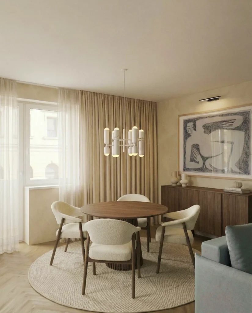
In the dining room, the colour blue features much more prominently, having become one of the defining shades of the overall design.
It doesn’t stand out too strikingly, nor does it seek to take centre stage. Rather, it acts as a subtle link between the kitchen and the living room. This is very important in a more open-plan space, where different functions coexist but still have their own distinct roles.
A with a choice of lamps We deliberately made it rhyme with ‘kitchen’. This way, the dining area does not appear as a separate decorative island, but functions as an integral part of the entire communal space.
Source: own design
The black details really came into their own here. Originally, they were only considered as a subtle contrast, but in the end the client fell in love with this direction too. The black does not make the space feel too austere; rather, it lends it a sense of poise. This has made the overall look a little more modern, a little more assertive, whilst still retaining its homely feel.
We love it when a space is made memorable not by a single grand gesture, but by many small, well-judged decisions. That is exactly what has happened here.
Colourful interior design in communal spaces
A colourful interior design One of the biggest challenges is ensuring that the colours do not function in isolation, but form a common language.
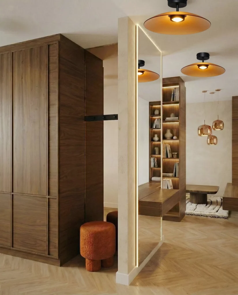
In this home, baby blue, terracotta, bronze, amber and black are not separate elements. Each has its own role to play.
Baby blue brings a sense of freshness and lightness. Terracotta adds warmth. Bronze and amber bring elegance, depth and a subtle play of light to the space. Black, meanwhile, creates contrast, defines the proportions and prevents the overall look from becoming too soft.
Source: own design
Taken together, these shades do not follow a trend, but rather help to build the flat’s own character.
This is particularly important in communal spaces. The kitchen, dining room and living room are in daily use. It is not enough for something to simply look impressive here; it must also be functional. The colours should enhance the way the space is used, the atmosphere and the natural rhythm of the space.
In our previous projects It was equally important that the interior of a modern family home should consist not of separate rooms, but of spaces that interact with one another.
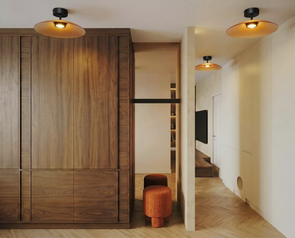
3. A wardrobe that frees up space in the hall
Of all the more personal spaces, the wardrobe is one of the most important functional elements.
This room is not only visually connected to the hall, but also complements it in terms of function. It frees up space in the entrance area, whilst helping to keep out of sight anything we would rather not have on display.
Shoes, coats, bags, everyday bits and bobs – everything now has its own place.
This is important because a hallway can easily become cluttered. If everything happens there, if everything ends up there, then that first impression can very quickly lose its sense of order. A well-designed wardrobe, on the other hand, takes this burden off the hallway.
Here, too, aesthetics are by no means an afterthought. Although the wardrobe is a functional space, it still blends in with the overall atmosphere of the home. This is precisely what makes practicality elegant, rather than a compromise.
Source: own design
4. Bedroom and en-suite bathroom with an adult theme
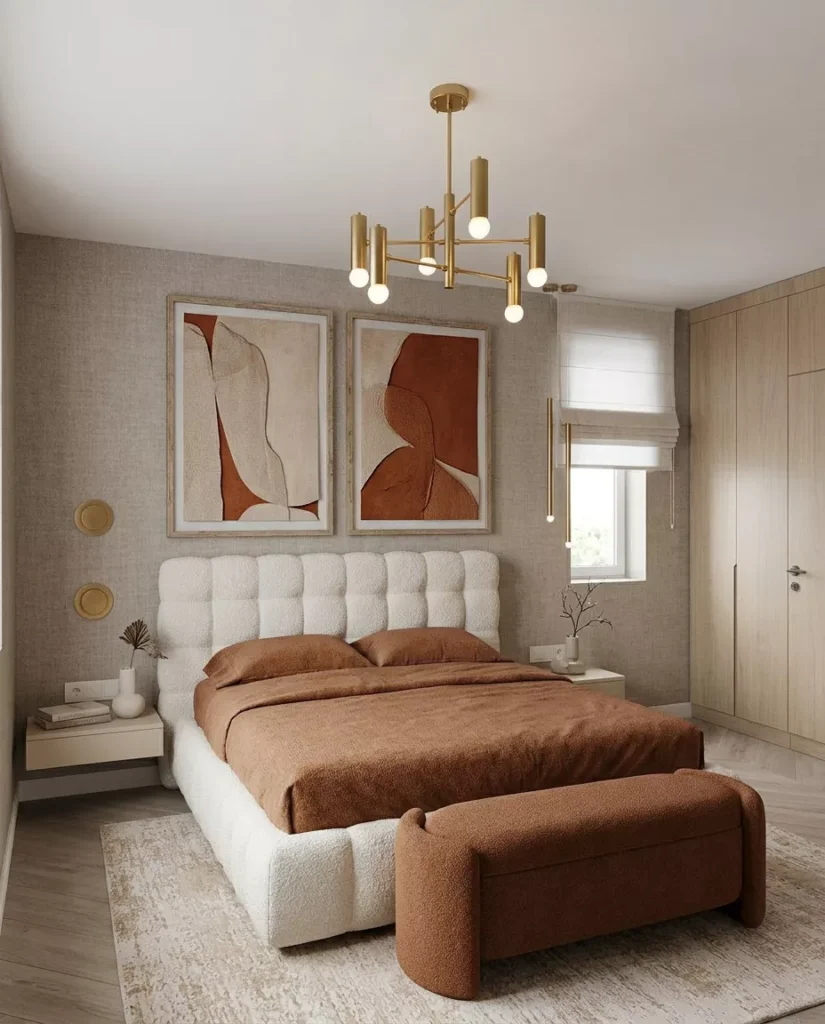
In the master bedroom, the terracotta and bronze details, together with the hidden features, create a calm yet distinctive atmosphere.
This room doesn’t seek to make a big statement. Instead, it is quieter, more intimate and more personal. The terracotta brings a sense of warmth, the bronze lends a touch of subtle elegance, and the concealed storage solutions help ensure that the bedroom remains a space truly suited to relaxation.
Source: own design
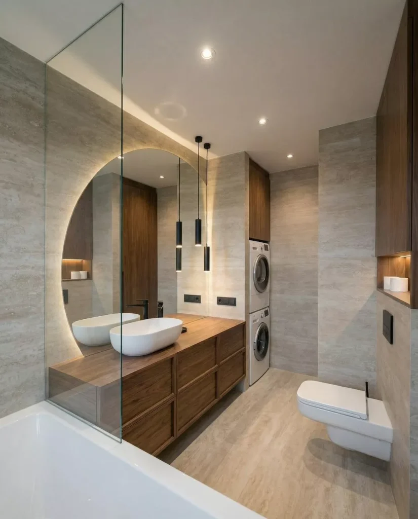
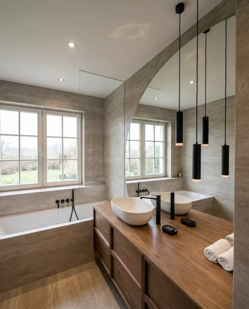
The adjoining bathroom has been given a more masculine, modern feel. The use of materials here is more distinctive, whilst the bronze details create a sophisticated, grown-up atmosphere.
Source: own design
In the case of the parents’ bathroom, the aim was not to make it playful. Rather, it was to ensure it remained elegant, distinctive and timeless. A bathroom that provides a calm, orderly setting for use, both at the start and end of the day.
Source: own design
Colourful interior design for families, designed to last
A colourful interior design It is truly successful if it not only responds to the current situation, but also leaves room for change.
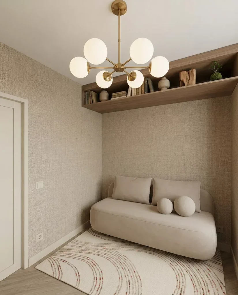
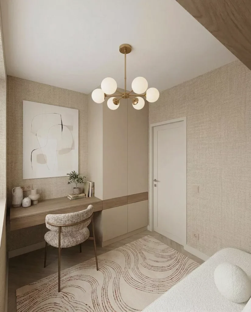
A very good example of this in this project is the room currently used as a guest room and a study. The space is already usable, but in the longer term it could even serve as a children’s bedroom, right up until they start school.
Source: own design
That is why we took a more restrained approach to the basic elements. We didn’t want to create rigid solutions that would no longer suit our lifestyle in a few years’ time. Instead, we created a backdrop that can easily be decorated, adapted and given new functions.
Source: own design
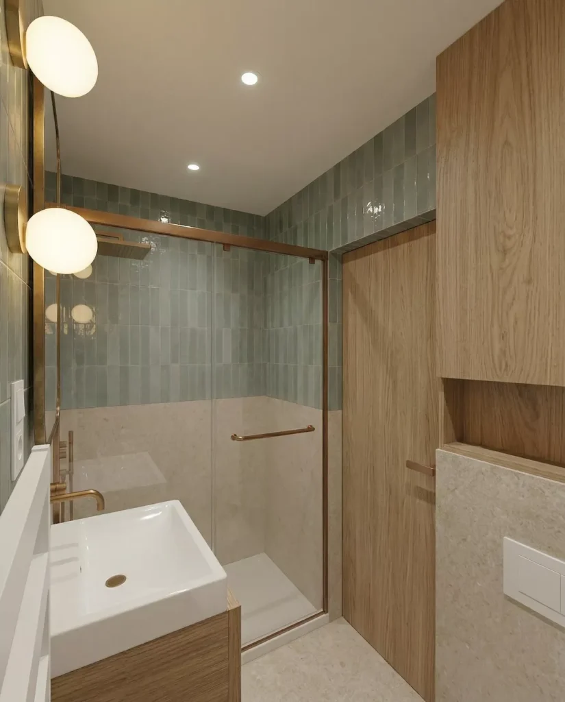
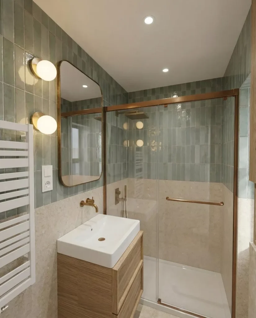
The adjoining bathroom with a shower, on the other hand, has been given a touch of playfulness.
Source: own design
This is where the minty shade makes its appearance – fresh and unexpected, yet blending beautifully into the world of bluish terracotta tones. It doesn’t seek to stand out at all costs, but adds just the right amount of character to make the space memorable.
The children’s bathroom has thus become fresher and more playful, whilst remaining true to the overall concept of the home. This contrast is particularly appealing: the parents’ bathroom is more mature and masculine, whilst the other bathroom is lighter, more youthful and bolder.
Source: own design
5. When the home unfolds from room to room
One of the best things about this project is that the home doesn’t reveal everything about itself all at once.
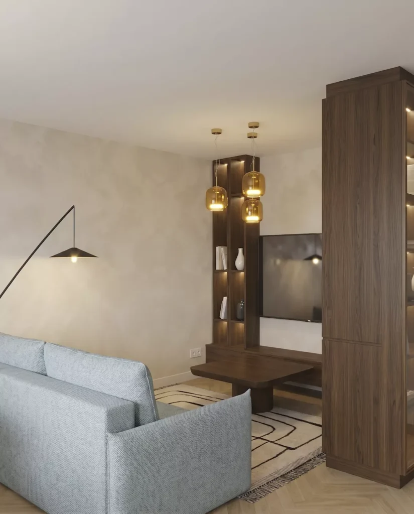
The communal spaces feature a subtle interplay of blue, bronze, terracotta and black. The wardrobe and hallway are all about organisation, concealed features and elegant practicality. The bedroom takes on a more intimate, warmer and calmer character. The master bathroom has a bolder feel, whilst the children’s bathroom takes a fresher and more daring direction.
Source: own design
And yet it all forms part of the same story.
This is what makes a home feel truly cohesive. It is not because every room is exactly the same, but because one can recognise a common theme, a recurring use of materials, a deliberate colour palette and a consistent system of proportions.
The end result is a home that is far more unique than it would have been had it been decorated entirely in beige. The baby blue, bronze, amber, terracotta and black details have not detracted from the tranquillity of the space, but have instead made it more personal.
And perhaps this is precisely one of the most important criteria for a good interior.
It’s not just beautiful. It’s not just practical. It’s also unmistakably the home of those who live there.
If you, too, would like a home that suits you not only in terms of its appearance but also in terms of its functionality, the on the contact page You can request a quote.
Summary
This project clearly illustrates that a home’s character often only truly emerges during the design process.
The beige, Japandi-Scandinavian base was a good starting point, but the final concept became much more personal with the inclusion of bolder shades. Baby blue brought a sense of freshness, terracotta added warmth, bronze and amber lent elegance, whilst black provided a modern contrast to the interior.
The rooms are not all the same, yet they form a cohesive whole. And that is what makes a home truly liveable, memorable and a place you will continue to love for years to come.